There are many recurring ideas in all different industries and there is the idea that 'it's all been done before'. This idea comes from all different ways for people to use a recurring theme, post modernism, bricolage and parodies.
Tropes are things that are repeated over time and eventually form a common convention. A trope maker is the initiator of the trope, an inverted trope is when the trop is reversed so the opposite is used or a subverted trope is when they are attacking the trope and challenging it.
Memes are ideas that aren't copied, like tropes, they are thought of at the same time.
Tropes are sometimes the representations that have built up about a certain thing, but in terms of music it is very closely related to the ideologies of the genre. For example pop music has tropes that it is fun, non explicit, whilst rock artists are said to be rebellious and all the tropes seem to reflect these.
Thursday, 23 February 2012

Wednesday, 22 February 2012

Tuesday, 21 February 2012
Different genres of music
Some different genres of music magazine:
- Garage Rock- this is a raw form of rock and roll that was first popular in America and Canada.
- Jazz - this is a musical style that originated in the beginning of the 20th Century
- Rock- this is heavily influenced by rhythm and blues, and country music and became popular in the UK and US
- Pop- this is a genre of popular music that derived from rock and roll.
- Acoustic-music that primarily uses instruments to produce sound entirely.
- Indie- artists that are not signed to commercial record labels.
- Indie Rock- alternative rock music with artists not signed to commercial record labels.
- Hip-Hop- a style that consists of stylised rhythmic music, that generally involve rapping.
- Beat boxing- a form of vocal percussion.
- Dance- music solely made to facilitate or accompany dancing.
- Dub-Step- a genre of electronic dance music originated in South London.
- Metal- a genre of rock music, with blues rock and psychedelic rock
- Folk- music that involves traditional and contemporary folk music
Sunday, 19 February 2012
Saturday, 18 February 2012
Mood Board

This is my mood board, I created this to enable me to recognise typical looks, layouts and structures of my chosen genre. My mood board presents Indie and Acoustic artists. I choose to include artists typical to the genre as it will allow me to style and present my model in a similar way, I also included some pre-existing magazine covers with these artists on the front as I can see how the colour schemes link and the structure. In addition on this mood board I have images of album covers from artists as I can see the difference between these and other genre covers. All of these give me a hint as to the ideologies of indie and acoustic music and how they are typically represented.
Monday, 13 February 2012
Conventions of Front Cover and Double Page Spread
All magazines have different house styles, but most magazines follow the same conventions. These need to be followed when making my magazine because the magazines I have studied are successful and going against these conventions could prove difficult and not be successful.
These are some of the conventions of a front cover:
- Title- this is a word or short phrase that sums up the magazine and is easily recognised by the target audience.
- Sell Line- these are positioned differently depending on the house style and the layout of the magazine.
- Image- there is always one main image that is usually connected to the biggest sell line. Sometimes there are other images on the front cover that are related to the other sell lines.
- Barcode- this is very small and usually in a discrete position along with the issue number and the price.
- Boost- most magazine use their main headline as their boost. Whilst other will use the advertising of a free gift as there boost.
- Background- this is usually a plain background so it doesn't distract from the other content of the front cover. It is simple and easy to replicate.
- Colour Scheme- this is generally a 4 part colour scheme.
These are some of the conventions of a double page spread:
- Title and billboard- these are at the top of the page and mainly spread across the double page.
- Image- this image is typically quite large and in magazines I have looked at they occupy a page of the article.
- Pull out quote- generally used in all magazine articles to attract the readers attention to particular parts of the article or make them read the whole article.
- Colour scheme- the colours used are not randomly selected they are generally part of a 4 or 3 part colour scheme, which makes the article more coherant. It seems the more unusual the older the audience the more simple the colour scheme.
- Captions- all the images usually have captions on them, so the audience feel as though they can relate to person featured in the article
Friday, 10 February 2012
Target Audience, Ideology and Representation
Every magazine that is published has a different target audience, whether this be a niche audience or a wide spread audience, this is particularily apparant in music magazines. Their are hundreds of different genres of music, some more popular than others, the magazines reflect the tone and audience of the specific genre. The way information is displayed through the magazine appeals to the target audience.
The front cover reveals a lot about representations of the genre of music, through the use of graphlogy:

Top of the Pops is clearly aimed at young girls between 8-14. The genre of the music, pop, is clearly stated in the title. The title is pink and glittery which is typically a girls colour and fits into the targe audience of the magazine. The font on the front cover varies with both serif and sans serif being used, the sans serif font of the title shows it is modern and simple. The colour scheme of the magazine is pink, red and purple, although red and pink usually clash, in this case it works and makes the heading and tag lines stand out. Generally this magazine shows typical conventions of a pop magazine, as it's target audience would find this very eyecatching and will draw them in.

The front cover reveals a lot about representations of the genre of music, through the use of graphlogy:
- Font - the size and the style
- Image- the angle and appearacne of the model
- Colour Scheme
Top of the Pops is clearly aimed at young girls between 8-14. The genre of the music, pop, is clearly stated in the title. The title is pink and glittery which is typically a girls colour and fits into the targe audience of the magazine. The font on the front cover varies with both serif and sans serif being used, the sans serif font of the title shows it is modern and simple. The colour scheme of the magazine is pink, red and purple, although red and pink usually clash, in this case it works and makes the heading and tag lines stand out. Generally this magazine shows typical conventions of a pop magazine, as it's target audience would find this very eyecatching and will draw them in.
Q is a magazine aimed at an older more mature audience, whilst
still mantaining a wide coverage of genres. The front page is very simple and not overcrowded, unlike the Top of the Pops. This shows that the magazine have recognised their target audience and that they prefer structure whilst a younger audience prefers colourful and exciting. Although it is aimed at an older audience they are maintaining a modern approach by using a sans serif font throughout the front cover. 

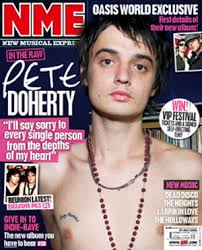
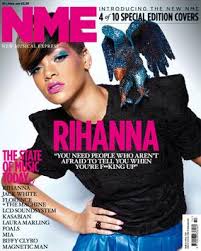
NME magazine has generally a rock/indie audience, with me alternative artists. This means automatically their demographic audience is much smaller so they can focus on the music and not the sales. This follows a three part colour scheme and the yelllow stands out against the darker background. The red and the yellow clash which would appeal to the target audience because they prefer to 'be different' and to not follow a crowd. There are very little sell lines around the front cover, suggesting that people that read the magazine will know what it will include.
All these magazines present ideologies about a group of people. Ideology is a set of beliefs a person or group holds and all music magazines hold these different ideologies, which affects the way they are represented. For example a magazine for an older audience of sophisticated music content would not generally have a image of Justin Beiber on the front, as it does not link with the ideologies of the audiences.
In the example of 'Top of the Pop's' there are several ideologies of pop music represented these are:
- Girly Colours
- Non violent imagery
- No sexual content
- Gossip
In the example of 'Q' the ideologies of mature musical interest shown are:
- Simple and Neat
- Varied interests musically
In NME the ideologies of alternative music are:
- Different (colour clash and image)
- Quite loud
- Loud
- Sexual Content
- Drug and Alcohol Use
Wednesday, 8 February 2012
Tuesday, 7 February 2012
Research Methods
There are many different types of research methods that can be categorised into four seperate groups.
- Primary Research-this is research that you carry out yourself. Examples of this research is .... Advantages of using primary research is,
- Secondary Research- this is using someone else's research or other people's resources.
- Qualitative Research- small scale research and involves longer answers.
- Quantitative Research- large scale research involving numbers.
Sunday, 5 February 2012
History of Top of the Pops
Brief History
Top of the Pops magazine is published monthly. It was launched in 1995 alongside a revamp of Top of the Pops TV show. They originally marketed it as the missing link between Smash Hits and NME, but the format gradually changed and included less music content and more content suitable for young girls. Although the TV show was cancelled the magazine is still published monthly.
Typical Content
You would expect to see chart information, star gossip, quizzes, competitions, posters and fashion and beauty advice. Typical articles would include 'Gossip2Go' and 'Your Problems Solved' with exclusive interviews with celebrities that would interest the target audience. The competitions are used to entice the audience into reading the magazine and they did this by advertising it on the packaging.
Typical Readers
There is no information about sales and readerships on the National Readership Survey (www.nrs.co.uk). So with other research I have seen that the typical target audience are 6-14 year old girls, which is reflected by the content of the magazine. The music interest of pop fit into this target audience as ideologies show that pop is innocent, sweet music that includes no swear words or rude language, whilst some pop artists like Rihanna and Katy Perry are challenging this, it is mainly still correct.
Magazine House-Style


Top of the Pops magazine is published monthly. It was launched in 1995 alongside a revamp of Top of the Pops TV show. They originally marketed it as the missing link between Smash Hits and NME, but the format gradually changed and included less music content and more content suitable for young girls. Although the TV show was cancelled the magazine is still published monthly.
Typical Content
You would expect to see chart information, star gossip, quizzes, competitions, posters and fashion and beauty advice. Typical articles would include 'Gossip2Go' and 'Your Problems Solved' with exclusive interviews with celebrities that would interest the target audience. The competitions are used to entice the audience into reading the magazine and they did this by advertising it on the packaging.
Typical Readers
There is no information about sales and readerships on the National Readership Survey (www.nrs.co.uk). So with other research I have seen that the typical target audience are 6-14 year old girls, which is reflected by the content of the magazine. The music interest of pop fit into this target audience as ideologies show that pop is innocent, sweet music that includes no swear words or rude language, whilst some pop artists like Rihanna and Katy Perry are challenging this, it is mainly still correct.
Magazine House-Style
- The title is typically pink and is at the top of the page and spreads across the page
- Several other images are displayed on the cover as well as the main image
- The sell lines are randomly placed
- The boost of the magazine is generally a quote from an article
Who produces and publishes the magazine?
Top of the Pops is produced and published by BBC Magazine.
History of NME Magazine
Brief History of NME
NME is also known as New Music Express. The first edition of NME was published in March 1952 and published weekly, after Maurice Kinn bought the Musical Express and Accordion Weekly and relaunched it. It was initially a non glossy tabloid music newspaper and moved to a magazine during the 80's. NME was the first British paper to have a singles chart and in the 70's it was the best selling British music newspaper. It supported a number of up and coming artists, and in the 90's started featuring indie artists. In 2008 the magazine had a redesign to make the magazine aimed at an older audience with less pop music and a more authoritative tone.
Typical Content
Typically NME is around 70 pages long and features rock artists recently including indie rock also they feature guitar bands. The magazine includes 'Track of the Week', 'The NME Chart'. Also you would expect to see reviews on music albums from new tracks and artists of the week, in addition you would see interviews with bands or artists such as 'Lana Del Ray' and 'The Maccabees'. Towards the back of NME you would typically find a gig guide and tour dates for featured artists and a competitions.
Typical Reader
According to National Readership Survey (www.nrs.co.uk) the typical age would be between 15-44 with 253,000 of them reading the magazine. This is a very broad age range, but only a smaller range within this group may actually buy this magazine. Also National Readership Survey shows us that only 86,000 women read the magazine and 167,000 males read it, showing that the target audience is males between 15-44. As the magazine includes new music artists and indie bands, it is quite a niche market making the magazine about the music and not about the money.
Magazine House-style

NME is also known as New Music Express. The first edition of NME was published in March 1952 and published weekly, after Maurice Kinn bought the Musical Express and Accordion Weekly and relaunched it. It was initially a non glossy tabloid music newspaper and moved to a magazine during the 80's. NME was the first British paper to have a singles chart and in the 70's it was the best selling British music newspaper. It supported a number of up and coming artists, and in the 90's started featuring indie artists. In 2008 the magazine had a redesign to make the magazine aimed at an older audience with less pop music and a more authoritative tone.
Typical Content
Typically NME is around 70 pages long and features rock artists recently including indie rock also they feature guitar bands. The magazine includes 'Track of the Week', 'The NME Chart'. Also you would expect to see reviews on music albums from new tracks and artists of the week, in addition you would see interviews with bands or artists such as 'Lana Del Ray' and 'The Maccabees'. Towards the back of NME you would typically find a gig guide and tour dates for featured artists and a competitions.
Typical Reader
According to National Readership Survey (www.nrs.co.uk) the typical age would be between 15-44 with 253,000 of them reading the magazine. This is a very broad age range, but only a smaller range within this group may actually buy this magazine. Also National Readership Survey shows us that only 86,000 women read the magazine and 167,000 males read it, showing that the target audience is males between 15-44. As the magazine includes new music artists and indie bands, it is quite a niche market making the magazine about the music and not about the money.
Magazine House-style
- The title is always on the left hand side
- The main image is a mid shot and they look directly at the camera
- Only a few other images on the page alongside the main image
- The boost is always about the model on the front cover
- The sell lines are more structured
- Always a 3 part colour scheme
Who produces and distributes NME?
NME is produced and distributed by IPC Media, UK's leading publisher of consumer magazines.
Friday, 3 February 2012
Main Task
Now I have completed my preliminary task, I am able to focus on the main task. For this task I must create a front cover, contents page and a double page article for a music magazine I have created. In order to do this I must research all different genres of music and look at pre-existing magazines to create a conventinal music magazine.
Thursday, 2 February 2012

Sunday, 29 January 2012
Prelim Task - Front Cover

This is my preliminary school magazine front cover, I have used many typical conventions shown in examples I have looked at. In this example the title is bold and is central showing relevance to the school it has been made for. This is displayed on a plain background, making the title stand out more. The sans serif font of the title connotes a modern tone, which shall attract the audience it is targeted to.
The mid shot displayed as the main image was taken on a plain background, it makes the front cover look more simplistic and makes the front cover simple.
I have used sell lines around the main images in order to display important content of the magazine. These follow the colour scheme of the magazine making the front cover more coherant and guiding the reader through it.
I could have included the school logo as it is a typical convention of school magazines, but i could not access the new school logo therefore it made it difficult to do this.
Thursday, 26 January 2012
Prelim Task - Images
These are some examples of the photos I took for the front cover of my school magazine:
1.

This image was blurred and the model was not central to the framing, also as the preliminary task stated it must be a mid shot this image is not as suitable to the task.
2.

Again the model was not central to the framing and in the background of the image is a light switch, this is irrelevant therefore I would have to crop this out or no longer use this image.
3.

Out of all the images I took, I believe this is the most suitable as it shows ambient lighting and the model is more central. Although there is part of the light switch in the background of the image, this can easily be edited out of the image. This would leave a mid shot of the model on a simplistic background.
Conventions of School Magazines
Through looking at the examples of different school magazines I have established conventions typical to these magazines, showing typical content and the layout of a front page. These conventions are:
- Title: Bold and clear, in a central position.
- Main Image: Presents the tone of the magazine and has a clear overview of the school.
- Sell Line: These should be present, but not largely important. Generally only a few and they give an indication and hint at the content of the magazine.
- Colour Scheme: Both of the examples I liked had a three colour scheme that was basic and coherent to the rest of the magazine.
- School Logo: These are relevant to the school, not on usual magazines however generally on school magazines.
Tuesday, 24 January 2012
Textual Analysis of School Magazine 3

In this example, they have tried to create a common theme of a scrapbook. However by doing this the title is not bold or clear. The use of the torn squares and the varied fonts of the different letters works on a informal scrapbook, however this does not work on a informative school magazine. I do not like this as it is not clear, it does not follow typical conventions of other school magazines I have looked at.
The three images in the centre of the front cover present to the audience the school environment, but does not make the front page clearer. The torn edges of the pictures are to link with the scrapbook theme, however create a messy sense. In this example there is no clear image to draw the readers attention and the images create no emotional impact on the magazine and don't add anything interesting to the cover. It would be more successful if the front image was of a student on a clear background, which would then present to the audience a tone of the environment of the school. Although I like the use of the school logo on the magazine as it is a common link to everyone who will read the magazine.
The front cover includes no sell lines so is difficult for the reader to understand what the main themes of the magazine are, and give no indication as to what the magazine includes and if there is anything of interest to the reader. Due to this it shows a dull and uninteresting tone to the magazine, therefore meaning no one will be interested in the magazine, with nothing acting as a hook.
Friday, 20 January 2012
Textual Analysis of School Magazine 2


Although this example is not for a particular school, it shows the typical audience of the magazine and what catches their eye. In this example the title, is again shown clearly and is relevant to the subject and purpose. The clear colour scheme of green, pink and orange is used on the front cover, however the use of yellow to highlight the '5 Answers to your school-safety questions' makes the front cover slightly less coherant as it does not link with the rest of the colours. By the title being the only thing orange on the page, it stands out the reader as the title and is bold and clear.
The text around the main image are used as teasers to give a hint to the audience as to what is to be expected of the magazine. These sell lines present a range of graphological features in order to highlight the more important and interesting articles in the magazine. The use of bold CAPITALS present the more important parts of the sell lines, they also show the audience that the information underneath in the same colour is an elaboration on the previous bold point.
I also like the image displayed on a white background, as it is not complex or distracting as well as not appearing too simplistic. This image of the student is simple and presents to the audience a educational environment as she is holding books and a bag. The mid shot of the girl is central to the magazine acting as hook to draw the attention of the reader. Due to the model smiling it makes the magazine seem light and friendly, therefore showing the tone of the magazine.
I think this front cover has shown to me what the target audience like and as it is an existing magazine, it also shows how successful this is. Also showing me the typical conventions of magazines of an educational theme. However it has not allowed me to see the typical content of a magazine for a particular school.
Thursday, 19 January 2012
Textual Analysis of School Magazine 1

The positioning of the 'Greenfields School' shows that it is the title and immediately shows the readers that it is for their school. The title is bold and clear, and contrasts the duller background and is larger than the other text showing it is important and relevant. Due to the central positioning of the title it shows that this is the title.
The logo and the colour scheme link into one another with the logo including green and blue and yellow. Due to the colour scheme linking with the logo it creates a professional and coherent appearance.
The logo and the colour scheme link into one another with the logo including green and blue and yellow. Due to the colour scheme linking with the logo it creates a professional and coherent appearance.
The main image is of the three children, they are smiling and show that they are happy. This medium long shot shows the audience that there is an upcoming event of a theatre production and also interests potential parents looking for a school for their child, as it shows they are happy and excited to learn new things. The three smaller images around the main image are relevant to the contents of the magazine and also act as teasers to the audience.
I also the like that the front cover is not littered with too much information. It shows the important information and things of interest, if they wish to read more then they are able to find the article in the magazine. This layout is very simple but effective is a professional appearance.
Welcome to my AS Media Blog
For my coursework task I will be producing a music magazine; front cover, contents page and a double page spread. I will be completing a prelim task before the coursework, this will be a School Magazine including a front cover and a mock up contents page, the front cover should include a mid shot of a student. To create a magazine conventional to the task given I will research and de construct examples of magazines.
Subscribe to:
Posts (Atom)